A data science pipeline starts with identifying your business problem and collecting the data of interest before analysis and interpretation by key decision-makers.
Let’s break down the data science pipeline and explore the steps and some pipeline tools that can help improve your pipeline workflow.
The Stages of a Data Science Pipeline
The data science pipeline follows a series of steps that take data from a source or integrate it from multiple sources and evaluate it to discover insights or answer a business question. It involves the following stages:
- Obtaining the data is the first step in your data science pipeline. It may involve querying data from databases or integrating it from multiple business sources via ETL tools or web scraping to collect unstructured data from websites. The collected data is stored in a structured, usable format like CSV, JSON, or XML.
- Data cleaning and pre-processing: Your end goal for a data science pipeline often represents an actionable insight, which is only as good as the quality of data fed into the pipeline, i.e., garbage in, garbage out. Feeding unclean and irrelevant data into the pipeline affects your data insights’ accuracy, usability, and reliability. This step performs data pre-processing and cleaning tasks like removing null and duplicate values and outliers, changing naming conventions, and validating your collated data to produce high-quality data for exploration.
- Data exploration: Also called exploratory analysis, this step involves examining the cleaned data to discover patterns or trends. It may include performing summary statistics, visualizations, or identifying variable relationships.
- Data modeling: This highly experimental and iterative step involves using statistical tools and techniques to create and train ML models using regression analysis, clustering, or classification algorithms. It often involves fine-tuning hyperparameters and other components to improve the model’s performance until it achieves the desired accuracy.
- Data interpretation: Here, we illustrate our new findings using visualizations like charts, dashboards, and reports to make them easily understandable to key business stakeholders and non-technical audiences. This step benefits from applying storytelling techniques to make findings relatable, unique, and impactful.
- Revision: Your pipeline model needs constant monitoring and evaluation to ensure the optimum accuracy and performance of the models, especially as business data changes with time.
Building a Data Science Pipeline
Here’s how you can start building your data science pipeline:
- Always start with a business objective: The data science pipeline aims to solve a business problem, which may sometimes be to evaluate potential risks or hazards (risk analysis), or to make predictions based on specific business parameters (forecasting). In either case, asking the right questions to establish a clear goal before embarking on the process ensures that you identify suitable data sources and that the pipeline design aligns with your goal. Knowing your goal also enables you to choose the right technology stack and establish clear data governance guidelines to protect data safety and security as data flows through the pipeline.
- Identify your data source(s) and collate the data: We identify our data sources and use tools to extract them in preparation for cleaning. This step may involve using ETL or data integration tools to extract data from databases or other data stores to create your dataset.
- Clean your data: This step produces relevant, clean, high-quality data for visualization and modeling. It involves removing unclean, irrelevant, or missing values to create a robust dataset.
- Visualizing data: Find out more about your dataset by visualizing your data to find hidden patterns and relationships between variables. This step further familiarizes you with the data and creates useful thoughts or questions that increase the quality of your analysis.
- Modeling the data: Here, your data is trained on ML models and algorithms to choose one that provides the best fit and accuracy. This step involves training and retraining the model to evaluate model performance.
- Model deployment and monitoring: Depending on business systems, the model is deployed to production to observe its performance on real-life data. This step requires constant monitoring to observe for model drift or decline in performance due to changing business data.
The Ongoing Data Science Pipeline Workflow
For your data science pipeline, deployment is rarely the last step. Your pipeline relies on high-quality data for downstream data processes. However, because data today is in a constant state of entropy, continuously evolving and changing, there’s the ever-present risk of data drift and infecting the pipeline with bad, outdated, and irrelevant data. Data drift affects your ML models, causing the model to decline and reducing its performance and accuracy.
Therefore, there’s a need for constant maintenance and mitigation planning to prevent any changes that affect the accuracy of your models. These steps may include implementing drift detection techniques or retraining with newly updated data to ensure optimal model performance and accuracy.
A Data Science Pipeline Example
Let’s look at a simple exploratory analysis of app data from the Play Store. This pipeline assumes the data is readily available and in a structured CSV format.
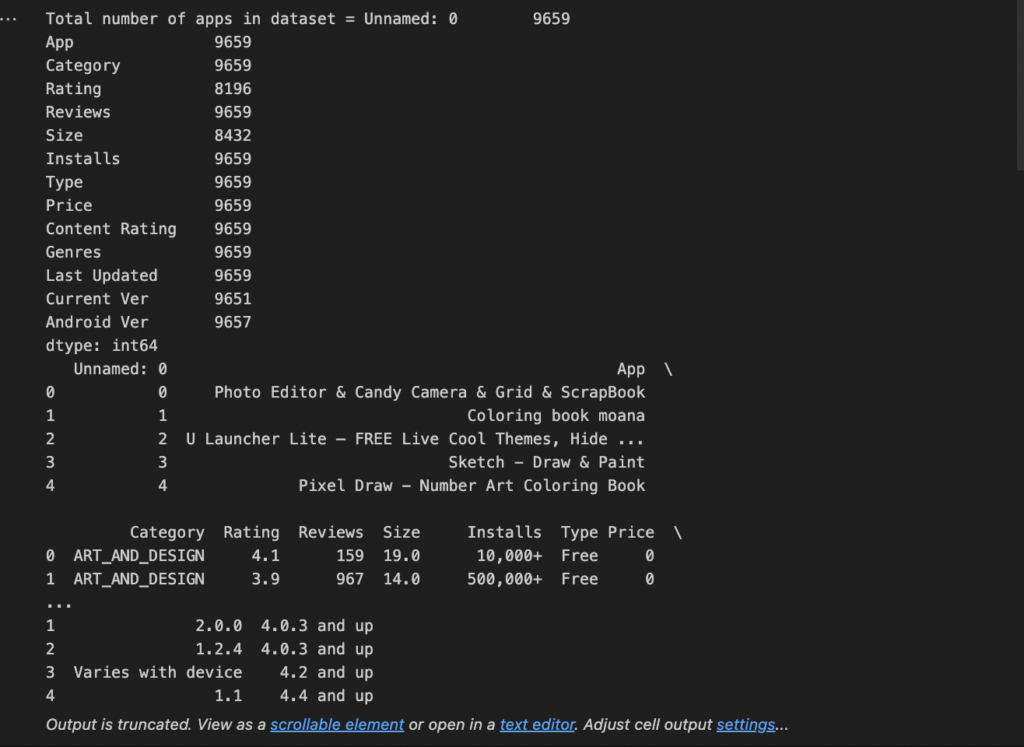
- Load your data. Our sample data is application data (apps.csv). We dropped duplicated apps and observed a random sample of 5 rows to see what our data looked like.
# Read in the dataset import pandas as pd apps_with_duplicates = pd.read_csv('datasets/apps.csv') # Drop duplicates from apps_with_duplicates apps = apps_with_duplicates.drop_duplicates() #get the total number of apps number_of_apps = str(apps.count()) print(f'Total number of apps in dataset = {number_of_apps}') # Have a look at a random sample of 5 rows print(apps.head(5)) |
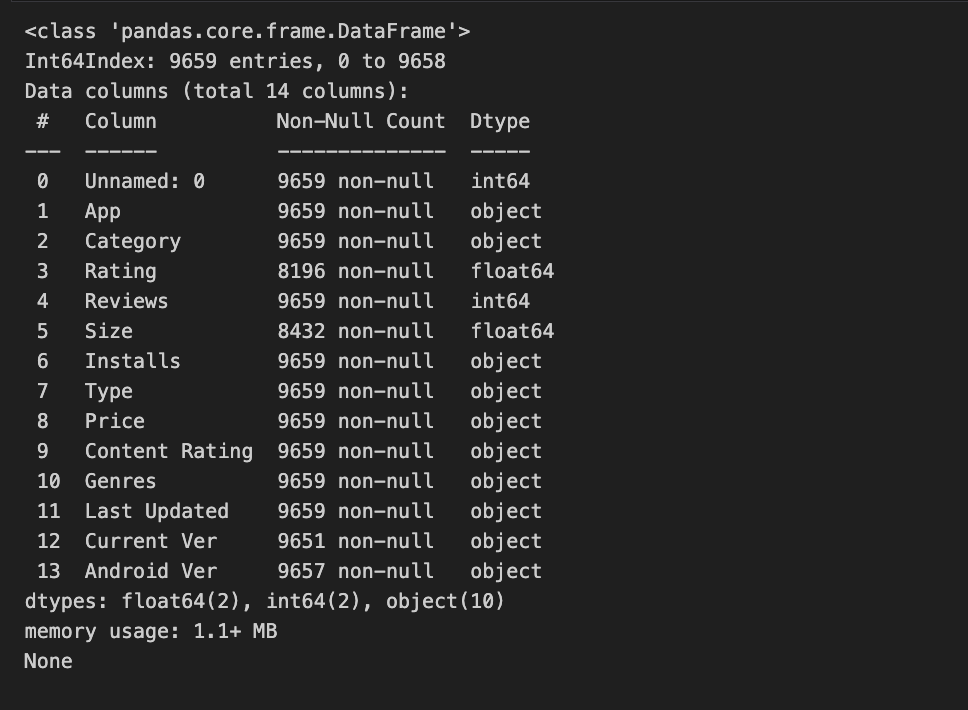
- Clean your data. Some columns (installs, price) in our dataset contain special characters, which can make it challenging to perform statistical calculations, so we removed the special characters to get a purely numerical dataset. Afterward, we printed a summary of our result data frame.
# List of characters to remove chars_to_remove = ['+',',', '$'] # List of column names to clean cols_to_clean = ['Installs', 'Price'] # Loop for each column in cols_to_clean for col in cols_to_clean: # Loop for each char in chars_to_remove for char in chars_to_remove: # Replace the character with an empty string apps[col] = apps[col].apply(lambda x: x.replace(char, '')) # Print a summary of the app dataframe print(apps.info()) |
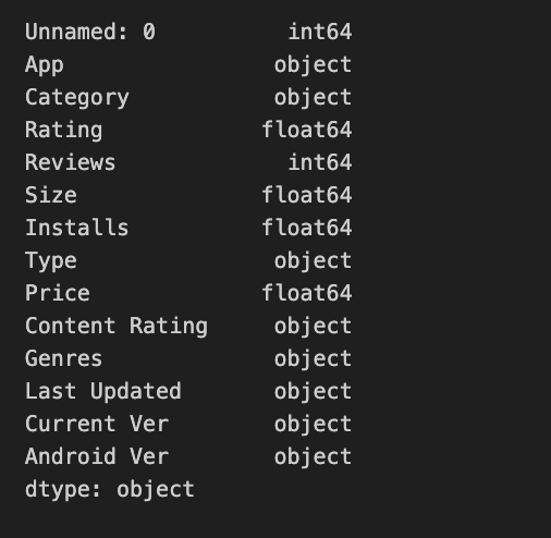
- Change data types. As another part of our data cleaning efforts, we changed the data types of some columns (installs, price) to floating type.
import numpy as np # Convert Installs to float data type apps['Installs'] = apps['Installs'].astype(float) # Convert Price to float data type apps['Price'] = apps['Price'].astype(float) # Checking dtypes of the apps dataframe print(apps.dtypes) |
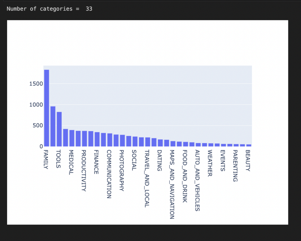
- Explore your dataset. Our application data provides a picture of audience distribution according to app categories. We can visualize the data to observe what app has the most users/downloads.
import plotly plotly.offline.init_notebook_mode(connected=True) import plotly.graph_objs as go # Print the total number of unique categories num_categories = len(apps['Category'].unique()) print('Number of categories = ', num_categories) # Count the number of apps in each 'Category'. num_apps_in_category = apps['Category'].value_counts() # Sort num_apps_in_category in descending order based on the count of apps in each category sorted_num_apps_in_category = num_apps_in_category.sort_values(ascending = False) data = [go.Bar( x = num_apps_in_category.index, #index = Category name, y = num_apps_in_category.values, #value = count )] plotly.offline.iplot(data) |
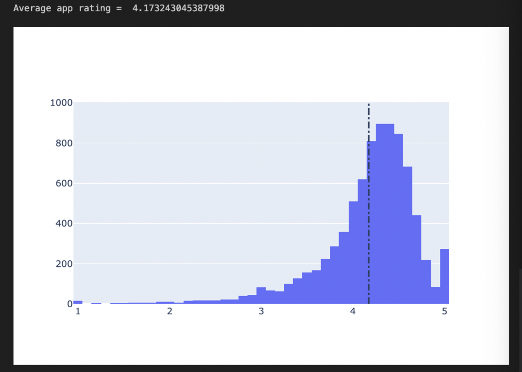
- Find the average rating for each app.
# Average rating of apps avg_app_rating = apps['Rating'].mean() print('Average app rating = ', avg_app_rating) # Distribution of apps according to their ratings data = [go.Histogram( x = apps['Rating'] )] # Vertical dashed line to indicate the average app rating layout = {'shapes': [{ 'type' :'line', 'x0': avg_app_rating, 'y0': 0, 'x1': avg_app_rating, 'y1': 1000, 'line': { 'dash': 'dashdot'} }] } plotly.offline.iplot({'data': data, 'layout': layout}) |
We observe that the average rating for our app is 4.17. Most apps cross 4.17, but a few fall short of this figure.
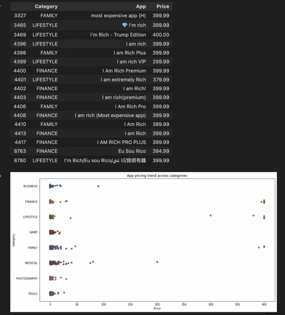
- Now, we want to determine if an app’s category affects monetization strategy, as the prices of apps may drive customers. Let’s find out what category of apps have the highest price.
import matplotlib.pyplot as plt import seaborn as sns fig, ax = plt.subplots() fig.set_size_inches(15, 8) # Select a few popular app categories popular_app_cats = apps[apps.Category.isin(['GAME', 'FAMILY', 'PHOTOGRAPHY', 'MEDICAL', 'TOOLS', 'FINANCE', 'LIFESTYLE','BUSINESS'])] # Examine the price trend by plotting Price vs Category ax = sns.stripplot(x = popular_app_cats['Price'], y = popular_app_cats['Category'], jitter=True, linewidth=1) ax.set_title('App pricing trend across categories') # Apps whose Price is greater than 200 apps_above_200 = apps[apps['Price'] > 200] apps_above_200[['Category', 'App', 'Price']] |
We can observe that although a large percentage of all apps are free, a few are paid and quite expensive, especially in the lifestyle, finance, and family categories.
Based on our simple pipeline, we can observe the following:
- Family-categorized applications have the highest number of downloads; although most are free, there are monetization opportunities.
- Although all the app categories have free and paid plans, prices typically don’t exceed $100. Further analysis into the performance of those exceeding $100 can help identify the app value and features to help plan your monetization strategy.
Note: This is a simple example. A real-life data science pipeline goes more in-depth and involves more iterative, complex data preprocessing, feature engineering, and hyperparameter tuning for more comprehensive exploratory analysis.
Complementary Data Science Pipeline Tools
Creating effective and high-performing data pipelines involves tools and technologies that handle the pipeline workflow, from data collection to processing, model evaluation, and deployment. Let’s explore these tools in detail.
Tools and technologies
- Data collection and preprocessing tools help collect and process your data in preparation for analysis and modeling. Data collection may involve using data integration tools like StreamSets to connect to multiple data sources to ingest and process your data in preparation for modeling and analysis. Most data integration and ETL tools have built-in Python libraries like Pandas and NumPy for data cleaning and preprocessing tasks. Pandas help with data manipulation and analysis, while NumPy is a Python library that helps process multi-dimensional arrays.
- Pipeline orchestration tools like Apache Airflow, Azure Data Factory, and Google Cloud Functions help automate and monitor your pipeline tasks.
- Machine learning frameworks like scikit-learn, TensorFlow, and PyTorch help build, train, and deploy your machine models.
- Container orchestration and deployment tools like Docker and Kubernetes let you deploy and manage your models. Docker provides a consistent environment that allows you to run your applications on different systems without errors.
- Cloud service providers like AWS, GCP, and Azure provide a wide range of storage, computing, and ML processing resources.
- Data visualization tools like Tableau and BI create interactive and informative visuals to illustrate your data and analysis results.
Languages
- Python is widely used because it’s easy and has a robust ecosystem of libraries that extend its functionality for use in data processing, building ML frameworks, and making visualization tools. For example, Pandas and NumPy are Python libraries employed for data preprocessing, while PyTorch, scikit-learn, and TensorFlow are common ML frameworks that use Python. Python is also the primary language for creating visualizations like Matplotlib and Seaborn and integrates with Tableau and BI to extract data from sources like databases, flat files, and APIs.
- SQL is used to communicate with relational databases and perform queries for data retrieval for analysis.
- R is used for performing statistical calculations, creating beautiful data visualizations, and for analysis. R is compatible with C, C++, Java, and Python.
How StreamSets Supercharges Your Data Science Pipelines
Your data science pipeline offers immense business value, empowering your business to do more with data, answering questions, or making predictions, which can guide future business plans. This pipeline often starts with collecting the required data and may involve using ETL pipelines and data integration tools like StreamSets.
Although not primarily a data science tool, the StreamSets platform can support your data science pipelines. StreamSets contain numerous connectors for connecting to your data sources, enabling you to fetch data to feed into your data science pipelines. The reusability of the pipelines also saves time for rewriting pipelines from scratch. StreamSets contains numerous processors designed to perform transformation tasks to ensure your data is clean and of high quality to improve the quality of your analysis.